Justin Calder, a performance-focused golf coach, approached me to develop a distinctive and modern visual identity for his coaching brand. The goal was to strike a balance between professionalism and approachability—communicating expertise, precision, and progress while maintaining a personal, welcoming feel. The branding needed to be versatile across various platforms including digital, signage, apparel, and social media, with a strong, recognisable logo mark that resonated with both amateur and seasoned golfers.
Outcome
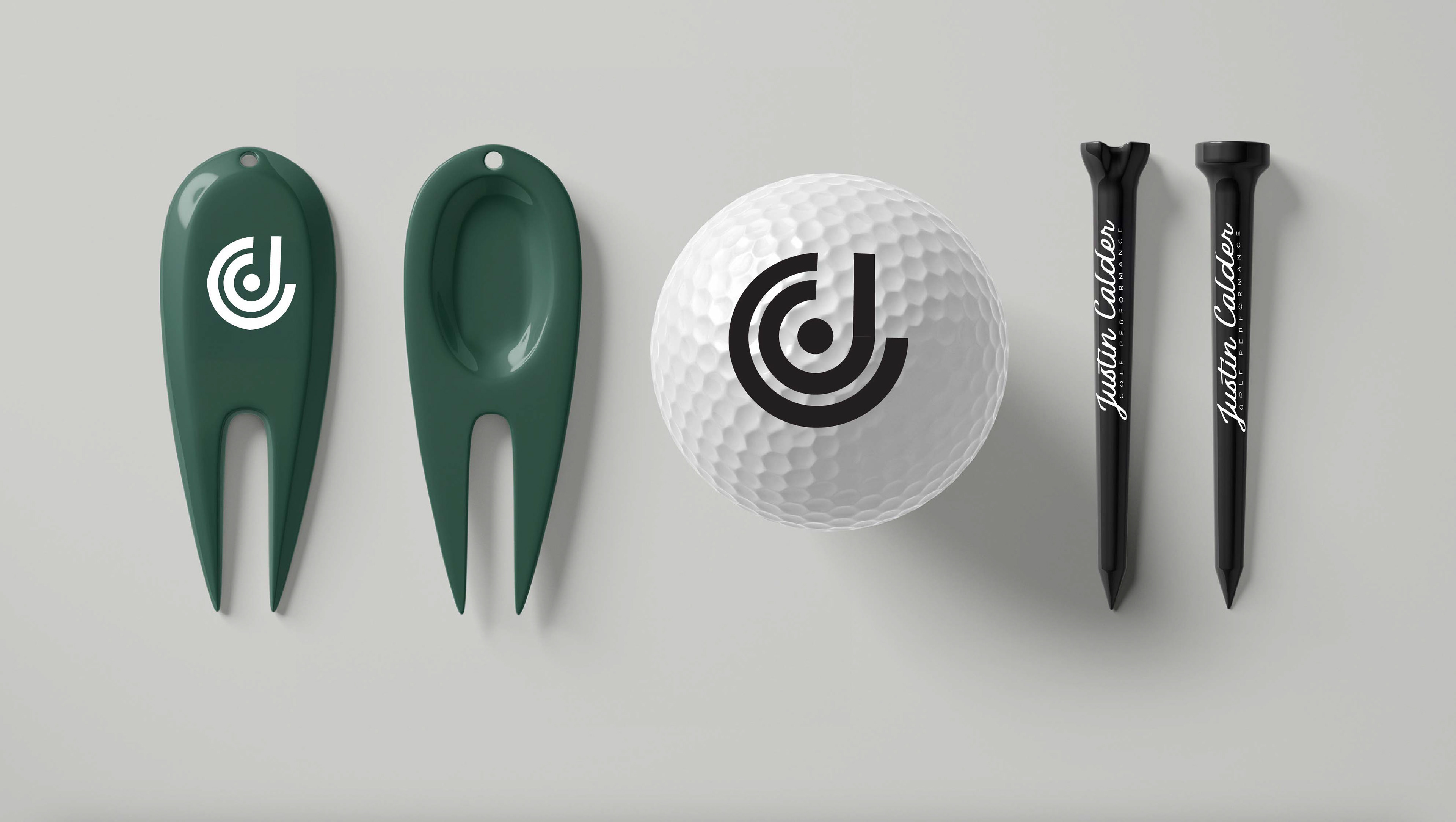
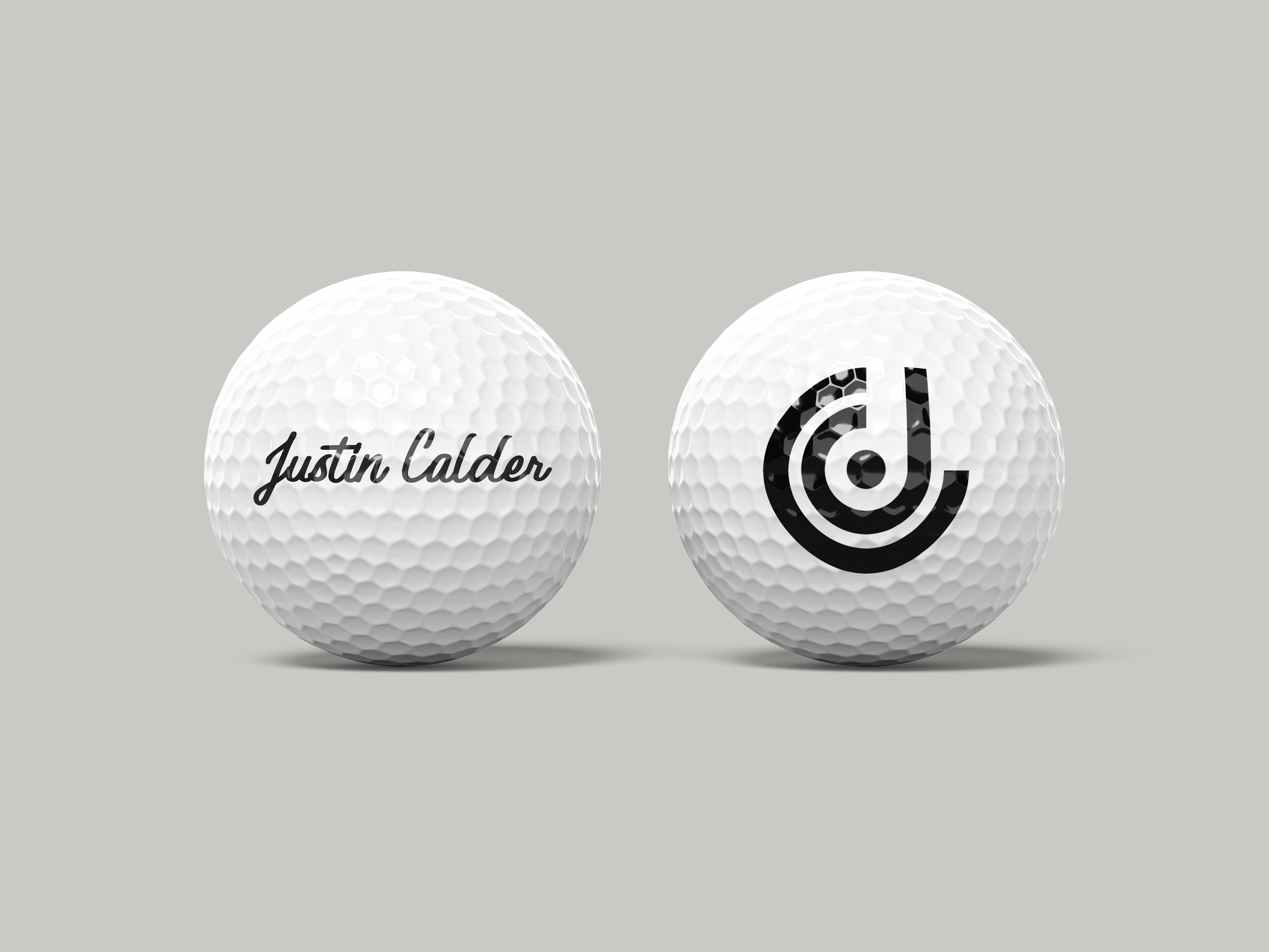
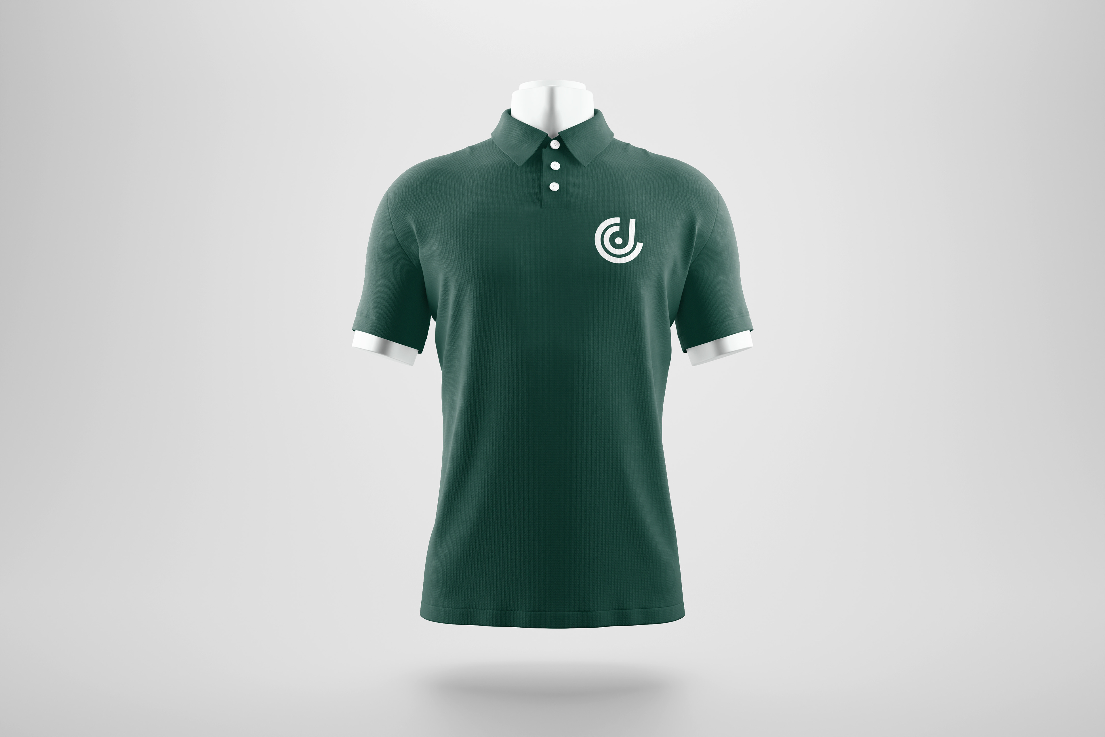
The final identity system is built around a bold, abstract monogram that cleverly integrates the initials J and C into a geometric, circular form. The mark is constructed using concentric arcs and a central dot—intentionally referencing the shape and motion of a golf swing, the layering of a golf ball’s dimples, and even the focused layout of a putting green. The circular movement evokes fluidity and control, core elements in Justin’s coaching philosophy, while the central point subtly symbolizes precision—the ultimate goal of any golf shot.
This logo mark is paired with a refined word-mark: a flowing, handwritten script that reflects Justin’s personable coaching style and hands-on approach. Beneath this, a modern sans-serif typeface provides balance and clarity, reinforcing a sense of trust and professionalism.
A deep green and white colour palette was chosen to echo the natural tones of the course, while also providing a clean, timeless aesthetic. The brand system is designed to work across multiple touchpoints, from illuminated shopfront signage to digital content and branded clothing—ensuring strong brand recognition in any setting.
Together, the visual identity reflects both the technical precision and the personal connection Justin brings to golf coaching.